This season, it’s much more difficult to find a good Manchester City DLS kit than it has been for years, and it’s all in the designs. Puma used gradients and fades as the basis for the entire 2026/27 collection, and gradients are the one thing that a low resolution 512×512 file can’t deal with. The poor copy and City’s home shirt are a plain block of blue with no effect at all.
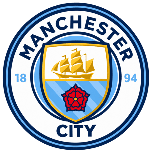
Manchester City LOGO
Official Logo 512×512
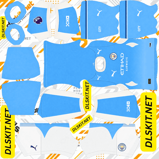
Manchester City Kit
Home Kit 512×512 (2026/27)
Kits update and links of logo and kit are checked on September 2026.
Why Manchester City DLS kits are unusually demanding this season
The campaign was dubbed “Not Your Typical City” and it was indeed not your typical city.
Home shirt is not a solid colour, but a gradient. The third kit features tonal gradient stripes, which intentionally obscure towards the sponsor. Even the away shirt is embossed and sublimated with a pattern, not graphics.
All three of those effects rely on the smooth transitions between shades. If a file is saved below 512 pixels, or compressed too hard, those transitions will show as steps. It is known as banding to designers and once you see it you can’t unsee it: what should be a smooth fade is now 4 or 5 distinct stripes of flat colour.
The City kits from last season were pretty much all sky blue and didn’t mind a mediocre file. This season’s “no do not”.
The 2026/27 home kit: a gradient, not a solid sky blue
City’s home kit is completely different to the club’s style.
The shirt is not a solid color, but rather fades from darker shades of sky blue at the shoulders to lighter shades as it goes down to white at the bottom hem. Puma’s concept was to present a visual history of the various sky blue City colours throughout their history in one outfit.
It is surrounded by a crisp white collar and cuffs on the sleeves. The club crest is also not in full colour, but in metallic silver, which is a change from the usual navy, red and gold colours of the club crest.
If a file you have found has a flat sky blue shirt with a coloured crest, then it is not this season’s. The easiest way to distinguish an old City home kit from the new one.
The 2026/27 away kit: black, gold and worker bees
The away shirt is the most local of the three, and will be released on 31 July 2026.
The base is black with pale yellow used on the logos, bright gold detailing is used across the collar, underarm side stripes and sleeve cuffs, mimicking City’s 1989-90 third kit. The pattern of worker bees is embossed all over the front panel, in sublimation.
The bee is the civic symbol of Manchester, and has been in use for a long time before it was used on football shirts, and is of Manchester’s industrial heritage. It is a symbol of unity, teamwork and grafting, and has a special significance in the city. Puma did not make it a secret element of the design, but placed it in the middle of it.
Black shorts and yellow socks round off the outfit.
Sublimated and embossed refers to the bees being woven into the fabric in shades of the base colour, instead of being printed on top of the fabric. They are easily seen on a good file, throughout the chest. On a bad one they go away and you’re left with a plain black shirt.
The 2026/27 third kit
This is the shirt that has the story in it and it’s a first in pro football.
In December 2024, Puma introduced a new feature called AI Creator, which enabled fans to create kit ideas using text prompts without any design expertise. More than 180,000 designs were submitted from fans in over 200 countries with over 1.7 million ratings. Ten finalists were then taken to a public vote and the winning concept was from a life-long City supporter called Elliott.
The final shirt was released on 27 August 2026. It is mainly white, with two vertical bands down the centre, one dark navy and one sky blue with tonal gradient sections that fade out towards the sponsor. There are also navy and sky blue panels towards the bottom of the sides. The crest is in its traditional colours while the Puma logo and the sponsor of Etihad Airways are navy.
There are two points of interest. The cuffs on the sleeves are embossed with a CITY pattern. Inside the neckline, the words “A.I. CREATOR” are repeated, as a reference to how the shirt was created.
It’s completed with navy shorts and white socks.
The difficulty in this is the fading stripes. They should melt slowly as they come into contact with the sponsor. If a file fails to contain the gradient, you get two hard-edged stripes that just stop – a totally different shirt.
Kit size and format for Dream League Soccer
512 x 512 pixels, PNG, less than 1MB.
These are the only dimensions that the game can cope with. Images are stretched onto the player model below, and lose exactly the gradient detail City’s shirts rely on. Frequently, files do not load above it.
A kit file should not be transparent, as is a club badge. Each area of the template must be filled with solid colour as the game is not mapping the image onto the chest, but onto a 3D model.
Importing a City kit step by step
If there is a copy button, use it to copy the kit URL, otherwise, copy it. The most common cause of an import being no effect is that you are taking the address from the browser’s location bar, which is likely to be a page, not an image.
In the game, go to My Club and click on Customise. Select Kit instead of Logo and then select the slot to be replaced. Hold down the URL box, paste and confirm. You should see the message “Image successfully downloaded”.
All slots are independent. If you have a full set, then you will run through this four times. Older versions of the game will display Download, newer versions Custom Kit.
For complete detail on “How to import kit in DLS” check this article.
Why gradients break in Dream League Soccer
It’s important to grasp, as it has been the cause of the majority of people’s dismay with City kits this season.
A gradient is a sequence of very close colour values that are very long. To render one smoothly enough requires that you have enough pixels to put in all those intermediate shades. If you have to fit the same gradient into a smaller number of pixels, there’s nowhere to fit in the in-between values, and the software has to round them off. The fade is reduced to bands.
Heavy compression has the same effect but for a different reason. This is another reason why the format is important, as PNG does not do this as well as JPG.
The test is easy to do. Before importing, open the kit file at full size and check the home shirt for the fade from shoulder to hem. The game will not correct it if you can see steps, it will make it worse.
Telling a 2026/27 file from an older one
The majority of City kit files are from previous seasons and a number of sites distributing them have not been updated for two years.
Look at the home shirt first. Body is blue and flat, it is an older season. This year’s fades to white at the hem.
Look at the crest colour of the home kit. The 2026/27 version is a monochrome metallic silver badge, rather than the full colour version.
Inspect away shirt. If not black with gold detailing and bee pattern, it is a previous campaign.
And when a page is talking about the kits in general, but not naming the gradient, the bees or the AI designed third shirt, it’s almost certainly pre-dating their release.
Do not skip the goalkeeper slot
The goalkeeper kit is not included in the three outfield strips and is the one that is forgotten.
The default keeper is immediately noticeable on the team screen, along with three custom shirts, all of which are displayed side by side. Deal with it in the same session.
Pairing the badge with the kit
A custom shirt featuring the stock crest on it is not a custom shirt. Select the same menu route (select Logo as you did with Kit).
The one thing that is particular to City. In 2016 the club changed its badge, removing the golden eagle and the three decorative stars, and the Latin motto, and replacing them with the circular crest with the ship, the three rivers and the red rose. There are surprisingly many City badge files available on the internet that are still the old design of the eagle and some sites still refer to the eagle as current.
If the badge you are about to import features a bird, then it is at least 10 years old. This crest is currently round, without an eagle and has the date 1894 at the base.
FAQ
How big is a Manchester City DLS kit?
512 x 512 pixels, PNG, less than 1MB. Kit files should not be transparent since the game does not lay them flat, but rather maps them onto a 3D player model.
What does the Manchester City 2026/27 home kit look like?
A gradient sky blue color that deepens at the shoulders and lightens to white at the hem, white collar and cuffs and a monochrome metallic silver crest and sponsor.
Why Manchester City’s away kit is black this season?
The 2026/27 away shirt will be black with gold trim and embossed all over with the Manchester civic symbol, the worker bee. The pale yellow treatment for the logo is a nod to City’s third kit in 1989-90.
Who designed the Manchester City 3rd kit?
A City fan, who used Puma’s AI Creator tool, named Elliott. More than 180,000 fan designs were submitted from over 200 countries and after a public vote, the winner was selected, it is the first fan designed AI kit to be worn in professional football.
My City kit is striped, not faded, why?
This is called colour banding, which is due to a small or over compressed file. Gradients require the entire 512 pixels to be smooth, and City’s 2026/27 shirts are very dependent on gradients.
How can I determine if a City kit file is this season’s or not?
Take a look at the home kit. Older kit has a flat sky blue body and full colour crest. The 2026/27 version is a white version with a silver monochrome badge.
Have the Manchester City badge got an eagle in it?
In 2016, No. City got rid of the eagle. This crest is circular, featuring a ship, three diagonal stripes representing the city’s rivers, a red rose and the date 1894.